In the past twenty years we have served and helped customers in many ways, all centered around graphs and how to enable a particular business vision with the help of graphs. There is usually the need for graph visualization and reporting in some way and this leads to the development of (custom) dashboard-like solutions. The challenge is always the fact that when it comes to reporting all solutions (say, PowerBI, Tableau and alike) are for relational data and not graph databases. For good reasons, the tabular format is easier to ‘linearize’ into a pie chart or a data grid.
In the same way, whenever you have graphs there is the need to edit them, the standard CRUD (create, read, update, delete) challenge. Here as well, there are tons of solutions for SQL backends but few for graphs. The OGMs (object graph models) are usually for Neo4j.
The re-creation of the same thing over and over again (as a consultant delivering bespoke solutions) is related to the fact that the intellectual property has to be unique and that in principle one can reuse some bits of code, in theory it never is that easy. Frameworks change, different backend flavors, different technologies. The technology landscape is every day a new challenge.
So, despite all constraints and challenges we set out to develop something best described as a stepping stone for graph-driven applications. The result is called Qwiery and is a set of open source tools to develop apps on top of graph stores.
Qwiery contains things like:
- a flexible data access layer
- a set of components to develop dashboards, terminals, notebook interfaces
- wrappers around our favorite graph visualization frameworks (yFiles, Ogma, Cytoscape…)
- utilities (working with datetime, strings, durations, colors…)
- entities and messages
- graphs (trees, graphs, random graphs, traversals…)
and much more. Each of these elements deserve a blog post on its own and the extensible data access layer is, in particular, a world on its own.
As show-cases we developed two full-fledge apps using Qwiery: Qwiery Dashboards and Qwiery Editor.
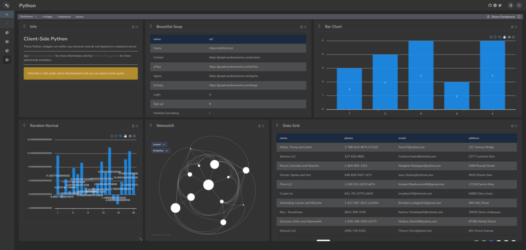
Qwiery Dashboards is a dashboarding app for graphs. It comes with:
- widgets specifically designed to query Cypher (property graph) databases like Neo4j and MemGraph
- client-side Python integration (enabling NetworkX, scikit-learn, pandas and numpy within the dashboards)
- yFiles graph visualization
- datagrids, pie chart, bar chart and all that
You can see the app deployed here.
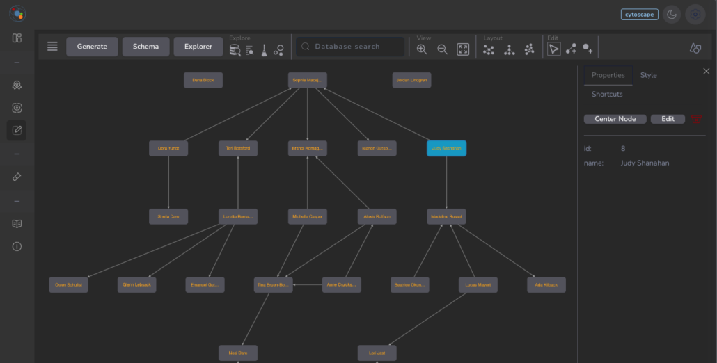
Qwiery Editor is a fairly standard graph editing app with:
- a pluggable graph visualization component (you can use yFiles or Ogma if you own a license, otherwise the Cytoscape wrapper will do as well)
- a Bloom clone of the path-query (that is, you can fetch data using a visual selector instead of writing Cypher)
- the usual CRUD functionality you can also find in tools like Graphlytic and similar
Most of the elements are open source under the MIT license and available on GitHub, and/or via NPM packages.
In addition, we have backend services (in Python, NodeJs and .Net) allowing to go beyond the open source offering and giving a lot more juice. Please contact us for more information.